Speaking at CSSConf Australia 2016
José M. Pérez / December 01, 2016
16 min read • 845 views
I just attended CSSConf and JSConf Australia in Melbourne, where I gave a talk about images and web performance. It was a blast! Very well organised and with a great atmosphere. In this post I give a short introduction about the event and I include links to the slides, videos and the script.

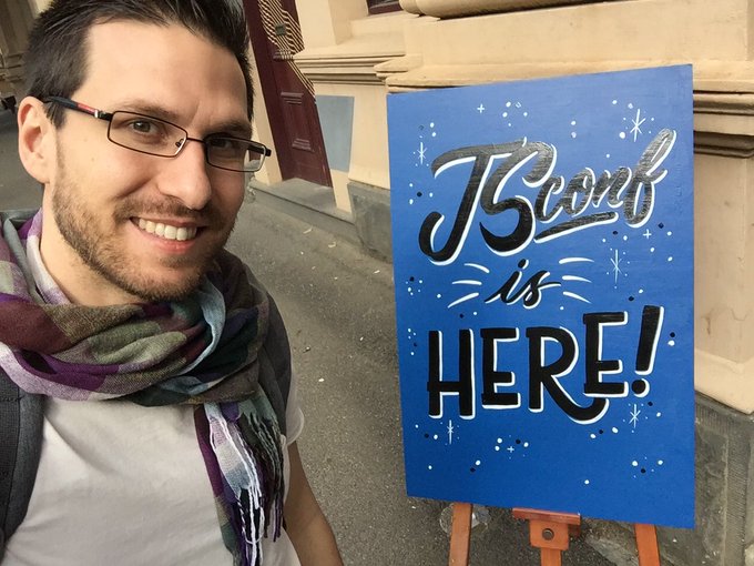
The CSSConf AU 2016 sign at the entrance.
JSConf is here! Let's do it!
Call for Papers and Organization
Back in August I sent a proposal for CSSConf AU 2016's Call For Papers and I got accepted. Just by reading their CFP it was clear this event was very well organised. I liked that the projects and companies mentioned in the CFP had to be renamed to PROJECT_A, COMPANY_A, etc to make the selection process more fair. It's also refreshing seeing speakers with very different background, and I love how the organisation has made diversity and inclusion the pillars of the triplet CSSConf / JSConf / Decompress. Details like the variety of food and live captioning show that they are serious about it.
As a speaker, they have been very supportive providing all the information about the event way ahead of time, and offering help with the design of the slides and preparation. And once in Melbourne they also prepared a nice welcome pack, including a SIM card that has been great for me to be in contact with my family during these days.
When they say it's taken them 9 months to prepare the conference I don't question it. One can see they had covered every little detail.
I recommend to check Brett Jones' write-up about the event, that is full with great pictures and descriptions about the talks.
Personally, it's the first time I travel so far from home, and I have also accomplished a personal dream of speaking at a top-level large conference.
My talk about "Progressive Image Rendering"
The talk I gave is based on some posts I have been writing during last 1.5 years. It's a combination of insights while redesigning (and rewriting) open.spotify.com, plus some smaller projects I had been working on, also related with images.
A month before the talk, the folks at Stockholm Web Performance Group gave me a slot in one of their Meetups to present it, which was really useful to get feedback. I fixed some typos, investigated some information that was missing and adjusted the length. Presenting it to a smaller audience made me present a first version of the talk, which I polished thanks to their feedback and an extended Q&A session, and be more confident.
Slides and video
The slides are available on jmperezperez.com/cssconfau16 and contain some animations and videos. A static version is available on SpeakerDeck.
The video of the talk is on Youtube:
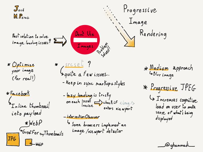
Last, but not least, Guillaume Hammadi drew this amazing illustration that summarises the talk:
Progressive image #rendering by @jmperezperez at @cssconfau #cssconfau16
Script
Here is the script for the talk.
Introduction
As users we like applications and websites to load fast, or at least feel like the load fast. As developers we struggle finding the best way to optimize and serve the assets needed for our projects in the best way.
We tend to talk a lot about the size of CSS and JS. We love discussing about this or that library, on saving some bytes at the cost of functionality. React vs preact?
It is very easy to forget about images. Images still represent roughly two thirds of the size of a web page, and the trend is pretty stable, increasing over time. Let's not forget about the main culprit.
In this presentation I want to discuss about images, making the case for using them and only then find the best way to serve them. I will talk about different ways to load images that some sites and applications use in real life. They try to improve the user's perceived performance using placeholders, blurry thumbnails and dominant colours.
Some of them are not as standard as we would like them to be, but they are there to fill a gap.
Like most developers, I try to get up to date with the latest techniques to build fast and pretty websites. I try many things, but only a few end up working. Some of those techniques are good in theory, but don't cover our use case completely.
I will show some examples of pages I have implemented or seen out there, and the issues found addressing image performance.
The case for using images
We've been using images on the web for a long time. Not only to show nice pictures, but also for rounded corners and gradients before CSS finished with these hacks. But it would be silly to try to improve the perceived performance of images that are not optimized, or are not even needed.
With the trend of flat and minimalist design we have reduced the need of images on the web. Fewer images also means less problems to make our site look good on multiple devices without sending too many bytes down the wire. And reducing images, especially bitmap ones, prevents us from generating several sizes and keeping an "original" image for future modifications (think of PSD files).
The fact of reducing the need of images also means that there is more bandwidth to load other resources. This is especially important in slow networks.
Some images might look great on desktop but provide little value on mobile. Maybe we don't even need to load that image in certain viewports. Setting the display property to "none" will hide the image, but won't prevent the browser from requesting it. A better alternative is to set a background-image using CSS. Similarly, hiding sections in your markup that contain images won't prevent the request. A better approach is to use a template engine that only adds to the markup the needed section. These days lots of people use a component-based library that will take care of this.
Optimising images
More info on JPG compression level, SSIM and Jpeg.io
I can't find a reason why not to optimize images. We have had good tools like jpegoptim and imageoptim for a long time. They will output the same image with fewer bytes. For formats like JPEG it is difficult for us to choose what compression level we should use. 80? 90? It really depends on the source image. There are tools that will find the best compression level to generate an image that is visually identical to a given one.
Performance is a difficult topic. A heavier page might be perceived as faster. Think of a page that inlines its critical CSS and lazy loads the full stylesheet. Overall, it is sending more bytes, but it will be perceived as faster.
Picture element and srcset/sizes
We have seen examples where we could avoid requesting an image and have gone through optimizations that we can apply to an image. For large images we have a valuable HTML element and img's attributes we can use. We can finally use responsive images in all modern browsers. You define what images you want to serve depending on some media queries.
In theory it is a good approach, in practice I see two things that are far from ideal.
Firstly, the browser knows the dimensions of the window, but needs extra information to pick the right image to download. This is so it can request the images without having to wait until the CSS is downloaded and parsed. The markup can get quite verbose, and these values depend on the visual design, which CSS is supposed to dictate. In the end you end up with duplication, and it is not easy to defined those media queries once and import them both in CSS and HTML.
Secondly, the lack of a standard lazy-loading solution. Most users don't scroll through the whole page, and it makes sense to delay the request of images below the fold until they are needed. The most performant request is the one that is never made. You want to use <img> for all images, since it's the most sensible and standard thing to do. But the browser sees them and requests all of them even if they are far from the visible area.
I wish there was a way for browsers to do this in a standard way.
A middle ground is to use responsive images for above the fold content, and lazy load the rest. This is in fact what we do in Spotify for pages like albums, where we display the cover art above the fold, and then we show a section with more albums by that artist, in which we lazy load the images.
How to lazy load
More info on How to lazy-load images to improve loading time and save bandwidth
When doing lazy load, we want to detect when the page is scrolled or resized, and then check whether the placeholder for our image is within the rendered section of the page. And this needs to be performed for all the images we want to lazy load.
Scroll listeners can have a negative impact in scrolling performance. During the scroll movement, the browser triggers many scroll events, and finding out the position and dimension of our images causes a layout recalculation. This is an expensive operation that makes the browser spend too long drawing frames, producing stuttering when scrolling. So what should be an improvement might spoil the perceived performance.
There is an experimental API called IntersectionObserver that suits very well this use case. Instead of subscribing to the scroll event, and then go through the lazy-loaded images, IntersectionObserver allows us to subscribe to an event that is triggered when the image enters the rendered area (viewport).
It is supported in Chrome and Opera, and in development in Firefox and Edge.
What to show while the image is loading
An interesting topic in loading images is what to show until the image is downloaded. And this is even more important when doing lazy loading.
When the image is loading we can do several things. The easiest one is not to do anything. We reserve some area in which the image will be eventually loaded. Another possibility is showing a placeholder. If you do this, try to use inlined SVG so they are served quicker.
Then we have the more interesting options. One could fill the area where an image is going to be loaded with a solid colour. The colour will be obtained from the image. It can be the dominant colour, the more vivid colour… There are libraries to extract these colours as a palette. A drawback is that you need some pre-processing of your images to calculate these colours.
One last option is to use a small version of the image, like a thumbnail, scale it and apply a blur effect. For this one you need to generate that smaller image, so it is the option that increases the size of the overall page the most.
Solid colour and blurry images are the ones that are used to improve user's perceived performance. We will see how real sites put them in practice.
Examples of solid colour
First of all, let's see examples of using a solid colour as the background.
Google added recently an option to Google Chrome, especially targeted to slow connections. In those cases it doesn't serve images, replacing them with a solid colour. Then, once the user taps on "Load images", those images are requested.
Arts and Culture is another example by Google, where you can browse art from museums. The placeholders give us a hint: we know that an image will appear there, we know the dimensions and we see a pleasant colour that transitions to the full image.
We don't need to go too far to see this in action. Search for images on Google and you'll see those placeholders. In case you are wondering, I was throttling the connection to record this. But if you are using a shared connection, or using internet on a plane, you will see them.
Examples of Progressive Image Loading
More info on How Medium does progressive image loading
Moving on, let's see some examples of sites that show a blurry image to transition to the final image.
One of the biggest sites using it is Medium. In this video we can see what the transition looks like. And because is web, we can inspect and see what's going on behind the scenes. In order to do this they render a div, then they request a small thumbnail image, which they draw to a canvas. Then thy apply a blur effect. At the same time they request the large image, and when it is received they replace the canvas with the image.
The markup for the technique includes a <div> for setting an intrinsic aspect ratio, then we have the small image, the large one, the canvas and a <noscript> tag to support browsers with JS disabled.
There are 2 interesting points in Medium's implementation. One is that the thumbnail, though very small, it's an external file. They could as well have inlined it in the initial payload. Secondly, <canvas> is an option for accomplishing the blur effect, but so are blur filter that can be applied using CSS or SVG.
Overall, one can't say it is straightforward, but the point is to achieve lazy-loading of images, and a seamless transition between a small thumbnail and the large image to improve perceived performance.
How do users perceive it?
It seems fair to ask ourselves how do users see it?. I searched on Twitter to find some reactions and this is what I found.
But since this is a subjective topic, we also find people who don't like it. This shouldn't surprise us. We have had a similar technique for a long time in the form of progressive JPEGs. However, only 7% of JPEG images are progressive.
"When, as with the Progressive JPEG method, image rendition is a two-stage process in which an initially coarse image snaps into sharp focus, cognitive fluency is inhibited and the brain has to work slightly harder to make sense of what is being displayed."
Users find it more difficult to process progressive JPEGs, even though at first sight we would think the experience is better.
Is this technique reliable?
"If you're viewing this on desktop and the above image looks a bit blurry, please refresh the page…"
It turns out that sometimes users end up just seeing the blurry images… which is probably worst than not seeing nothing at all.
Facebook - Inlining thumbnail image in payload
Medium are not alone on this. Facebook has also experimented with it for their mobile client in developing markets like India. For loading a profile page for a user, their app would make a request to fetch the data, which included the url for the cover photo image. Then, they needed to make a second request to fetch the image.
This is pretty standard, but they wanted to try to serve a small version of the image in the payload of the first request. They decided it should be smaller than 200 bytes for this to be worth it.
There was a problem, though. The headers of a JPEG image are larger of 200 bytes, but removing it they were close to 200 bytes. So they decided to use a common header for all images, which is stored in their client, and then only the JPEG data is returned.
Quite creative, right? In the path to solve the problem with loading images, we end up questioning the current formats and find work-arounds.
Generating tiny thumbnails
More info on Using WebP to create tiny preview images
I came across the article several months after it was posted. When I read it I wondered, how small can JPEG images be? I scaled down a few cover arts to 42x42 pixels, which is the size Facebook uses according to their post. And effectively, they were larger than their 200 Bytes budget.
Then I tried with other formats, like GIF and PNG, but they were even bigger. Until I tried with WebP, which resulted in roughly 1/4th of the size of the JPEG. One could say that the images are not exactly the same, and they are right. But once we apply a blur effect they look almost the same.
Regarding support for WebP, we should keep in mind that Facebook was trying to solve this for their mobile client. And there are libraries for rendering WebP on Android and iOS, so this seems a good solution.
Getting creative with SVGs
More info on Using SVGs to achieve a cool drawing effect
Who doesn't like SVGs? They are powerful and they can also be applied to image loading.
Some time ago I came across this site. It's a review for the PS4 on Polygon.com. They use SVGs with an animation that looks like the image is being drawn.
Given a SVG it is easy to apply an animation of the stroke dash, as we see in this Spotify logo. On my quest to finding other ways to represent images, I thought of this technique. Sure thing, given a SVG we can "draw" it. But how can we apply this to bitmap images? Do we need to vectorize them?
It turns out we can draw the edges of an image. For that, we can detect the edges using an algorithm like Canny Edge. And the result is quite fun. The SVG is drawn and finally transitioned to the full image. We can detect edges, create polylines with SVG following those edges and apply the same technique we just saw to animate them.
The idea would be to pre-generate SVGs server-side, and inline them in the HTML. We have full control on how many lines to draw and the amount of detail. We can use a smaller version of the image to generate the points, still getting an accurate set of polylines. And the resulting SVG can be further optimized with svgo, and its size is around 2 or 3kB.
Conclusions
Should we do this? I believe these techniques should be part of your toolbelt. The picture element is great for some applications, but we need to consider other scenarios like lazy-loading. Every approach has its advantages and disadvantages and we should use the more appropriate tool.
The Web is fun. You can right click and see the source code. The web is a great environment for anyone to learn. Go and experiment making your site faster.
Thanks!