How Medium does progressive image loading
José M. Pérez / October 19, 2015
9 min read • 45,615 views
tl;dr: Medium uses a technique called progressive image loading to improve the performance and user experience of its website. This involves loading low-resolution versions of images first, and then gradually replacing them with higher-resolution versions as they become available. This allows users to see images on the page more quickly, without having to wait for all of the high-resolution versions to download. Progressive image loading can help to improve the perceived speed of a website, and can also save bandwidth and reduce page load times.
Recently, I was browsing a post on Medium and I spotted a nice image loading effect. First, load a small blurry image, and then transition to the large image. I found it pretty neat and wanted to dissect how it was done.
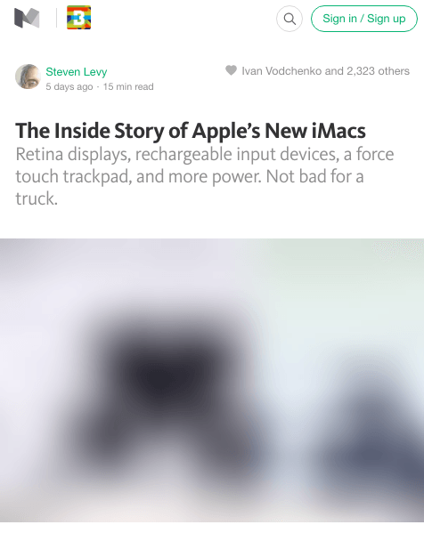
A screenshot of a blurry placeholder while the image is loaded
Medium's technique
To see how image loading works in Medium, it is best to see a demo:
I have performed a test with WebPageTest for this page on Medium where you can see how it loads too. And if you want to see it by yourself, open Medium's post in your browser, disable the cache and throttle the response so it takes longer to fetch the images and you can see the effect.
Here is what is going on:
-
Render a div where the image will be displayed. Medium uses a
<div/>with apadding-bottomset to a percentage, which corresponds to the aspect ratio of the image. Thus, they prevent reflows while the images are loaded since everything is rendered in its final position. This has also been referred to as intrinsic placeholders. -
Load a tiny version of the image. At the moment, they seem to be requesting small JPEG thumbnails with a very low quality (e.g. 20%). The markup for this small image is returned in the initial HTML as an
<img/>, so the browser starts fetching them right away. -
Once the image is loaded, it is drawn in a
<canvas/>. Then, the image data is taken and passed through a customblur()function You can see it, a bit scrambled, in themain-base.bundleJS file. This function is similar, though not identical, to StackBlur (see current source code at flozz/StackBlur)'s blur function. At the same time, the main image is requested. -
Once the main image is loaded, it is shown and the
canvasis hidden.
All the transitions are quite smooth, thanks to the CSS animations applied.
Markup
A bird's eye view of the markup for an image:
<figure>
  <div>
    <div />
    <!-- this div keeps the aspect ratio so the placeholder doesn't collapse -->
    <img />
    <!-- this is a tiny image with a resolution of e.g. ~27x17 and low quality -->
    <canvas />
    <!-- takes the above image and applies a blur filter -->
    <img />
    <!-- the large image to be displayed -->
    <noscript />
    <!-- fallback for no JS -->
  </div>
</figure>
And a concrete example, so you see what goes in those tags:
<figure
name="7012"
id="7012"
class="graf--figure graf--layoutFillWidth graf-after--h4"
>
<div class="aspectRatioPlaceholder is-locked">
<div class="aspect-ratio-fill" style="padding-bottom: 66.7%;"></div>
<div
class="progressiveMedia js-progressiveMedia graf-image is-canvasLoaded is-imageLoaded"
data-image-id="1*sg-uLNm73whmdOgKlrQdZA.jpeg"
data-width="2000"
data-height="1333"
data-scroll="native"
>
<img
src="https://cdn-images-1.medium.com/freeze/max/27/1*sg-uLNm73whmdOgKlrQdZA.jpeg?q=20"
crossorigin="anonymous"
class="progressiveMedia-thumbnail js-progressiveMedia-thumbnail"
/>
<canvas
class="progressiveMedia-canvas js-progressiveMedia-canvas"
width="75"
height="47"
></canvas>
<img
class="progressiveMedia-image js-progressiveMedia-image __web-inspector-hide-shortcut__"
data-src="https://cdn-images-1.medium.com/max/1800/1*sg-uLNm73whmdOgKlrQdZA.jpeg"
src="https://cdn-images-1.medium.com/max/1800/1*sg-uLNm73whmdOgKlrQdZA.jpeg"
/>
<noscript class="js-progressiveMedia-inner"
><img class="progressiveMedia-noscript js-progressiveMedia-inner"
src="https://cdn-images-1.medium.com/max/1800/1*sg-uLNm73whmdOgKlrQdZA.jpeg"></noscript
>
</div>
</div>
</figure>
Note that the actual image sizes requested depend on the device.
An attempt to reproduce the effect
I have prepared this CodePen where I have implemented the same effect, though using CSS filters for the blur instead of a canvas (see below more info about this variant).
Here is a demo (click 'Run Pen' to run it):
You can see it better in full screen. I recommend that you use network throttling and disable cache to notice the full animation.
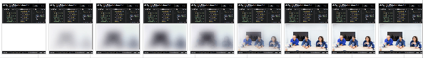
This filmstrip view shows the above codepen when disabling cache and throttling to "Good 3G":
Is it worth it?
Clearly, there is a lot of things going on to be able to render an image this way, and it can be discouraging to do something similar on your site. A few years ago it would have been impossible to do this animations and blur effects in a performant way, but the truth is that most of the times the latency is the bottleneck, not the device capabilities, and we can play with these visual explorations.
Having full control of the loading of images has some advantages:
-
Lazy loading. Using JS for making the requests allows them to be in control of what images are requested. While all the small thumbnails are requested, the large images are only requests when they are within the viewport.
-
Better placeholder. The thumbnails are very small, barely 2kB, which combined with the blurry effect allows for a better placeholder than a solid colour, without sacrificing payload.
-
Tailored image sizes. Medium serves different images sizes depending on the device that makes the requests, which optimises the weight of the page.
Variants
Before finding out about this technique, I thought of using a similar approach for a site I'm working on.
Inlining image data
Instead of making a request for the small thumbnails, it is possible to inline them using data URIs. This increases the size of the HTML, but accelerates the rendering of the placeholder, which is immediate one the markup is downloaded. The blur effect allows these images to be really small. I did some tests with 0.5kB size images, and the result was similar to using a 4x larger image.
Blur effect
By default, when a browser renders a small image scaled up, it applies a light blur effect to smooth the artefacts of the image. The effect can also be turned off for images like QR codes.
[...]the browser would render it in a way that didn’t make it look blocky[...] from Google Developers.
This works both in Chrome, Safari and Firefox (I haven't tried on IE yet), though the smoothing effect is more prominent in Chrome. Here is a demo, but you can see it better in full screen:
Note how the artefacts are smoothen. Keep in mind that the image is only 27px wide and has very low quality, which should result in an awful scaled-up version, but it isn't. If the above effect is enough for you, then you don't need to use more complicated alternatives.
The blur effect can also be achieved using CSS Filter Effects. Its support is quite wide aside from IE. I'm pretty sure Medium tried this before going to a canvas solution, which feels far too over-engineered, but for some reason they decided not to use it.
The advantage of this technique is that you can easily tweak how much blur you want and everything is achieved using CSS.
Another option is to use a SVG filter, as explained in The “Blur Up” Technique for Loading Background Images and Textured Gradients in Pure CSS.
Other ways of improving placeholders: Google Images Search
A simpler technique is used by Google Search when searching for images from a smartphone:
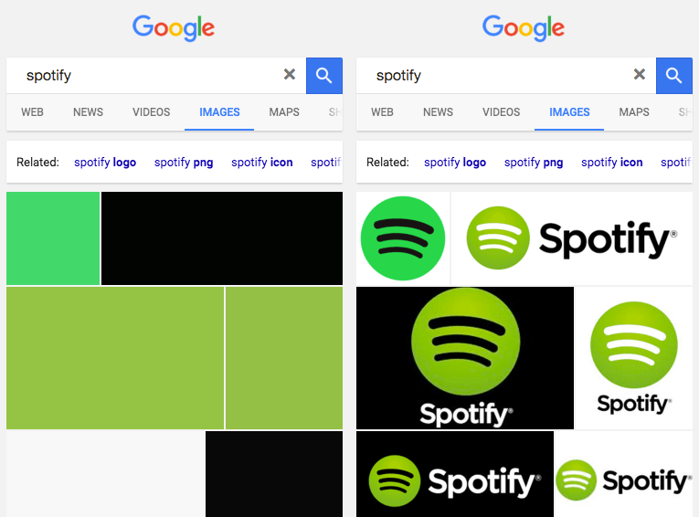
Google Images Search shows a solid background as placeholder (left image is while loading, right when already loaded).
They pick a colour (maybe the dominant colour of the picture?) and they use it a solid colour background. It gives the user the feeling that images loads faster.
An even more advanced one: Facebook's 200 byte technique
Earlier this year Facebook posted "The technology behind preview photos", an interesting article about serving 42 x 42px image previews without the JPEG header.
The scenario is a bit different, since these "images" are served to the Facebook mobile client, which knows how to prepend the header to compose a valid JPEG image. In the case of a website, we would need to compose this using Javascript, which would probably remove most of the savings. A solution would be to use a Service Worker to do the composition, though we would still need some Javascript to send a "request" with the image contents.
In any case, it seems a bit overkilling for the web, but I wanted to include it as a reference. Using WebP for generating this preview images can lead to similar savings without having to resort to "creative" solutions.
LQIP: Low Quality Image Placeholders
Instead of waiting for the final image to be rendered, we can serve a highly compressed image first, and then switch to the large one. This is what Low Quality Image Placeholders (LQIP) consists of. The idea is similar to Medium's, but serving an image with the same dimensions but higher compression.
Conclusion
As our pages load more and more images, it is good to think of their loading process on our pages, since it affects performance and user experience.
If you are generating several thumbnail sizes for your images, you can experiment using a very small one to use it as the background while the final image loads.
Related Posts
- I gave a talk at CSSConf about progressive images. You can watch the video and slides on Speaking at CSSConf Australia 2016.
- I collected more examples of sites using a similar technique on More examples of Progressive Image Loading and How to use SVG as a Placeholder.
- Interested in other image tips and tricks? Check out Image optimization: Lossy, lossless and other techniques.