Line-height, multiline ellipsis and responsiveness
José M. Pérez / July 09, 2013
2 min read • 414 views
Recently I was implementing a pinterest-ish layout in which the elements have a specific height. These elements contain a title that can expand multiple lines, and an additional text to which I would like to apply a multi-line ellipsis. Initially, I don't know how many lines of text the title will take. The text can be arbitrarily long, and depending on the screen width this number will vary.
Multiline ellipsis
There are many ways of achieving multiline ellipsis or line clamping. However, I wanted to use an approach that didn't need javascript and could work not knowing in advance how many lines of text are available.
Line-height to the rescue
I have coded a jsfiddle that helps to visualise how this works. Try changing the width of the "Result" window dragging the vertical separator.
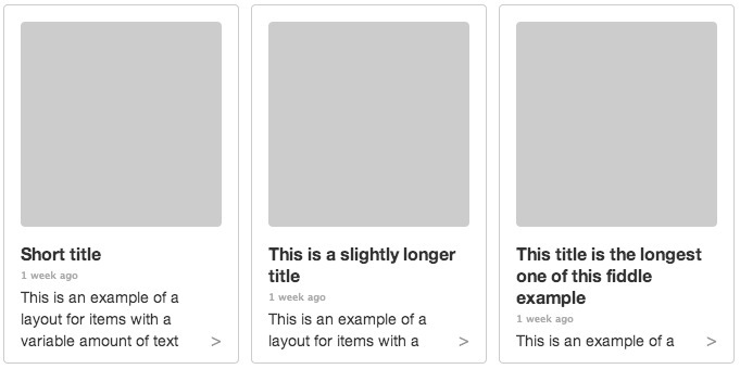
And a screenshot, in case you have problems visualising the jsfiddle:

Using the same line-height for the text. Notice that the title can take a different amount of lines but the text underneath is not cropped.
The best thing is that you can change the available space, and the image (represented with a grey square) will scale properly, the title will adapt to the available room and the text underneath will try to fill the available space. Check this example that shows the same items when the width increases. I found this out having a look at the Discover feature on the Spotify Web Player, I realized that even though the images were scaled when changing the screen width, the text underneath was never cropped. It turns out that every line of text has the same height, regardless of the font size. Thus, the title can expand multiple lines and will push the rest of the text. The lack of ellipsis is solved by adding a "More" link:

Detail of an item in the Spotify Discover feature. When hovering, the "More" link is shown