How to lazy-load images to improve loading time and save bandwidth
José M. Pérez / July 31, 2016
7 min read • 1,710 views
tl;dr: Don’t load images that the user doesn’t see on screen. It is easier than you think.
What is lazy loading
Everyone has seen lazy loading content on web sites and mobile apps. You start seeing some content, and as you scroll, more content gets loaded.
A web page and all its requests
In the case of web pages, it hasn’t been that easy for developers to find the balance between creating many small resources or serving a big one. A trend these days consist of inlining critical resources, the ones needed to render content above the fold, and load the rest of CSS and JS asynchronously. This is easy to do in small static sites, but more difficult for larger sites with dynamic content.
Delaying the request to some assets has lots of benefits:
- Less data usage for the user. This is especially important on mobile, where lots of users have poor network connections and restrictive data plans.
- The server or CDN has to serve less data, which translates to a cheaper bill for the site.
- Important content gets prioritised. The same bandwidth is used by fewer requests in parallel, so it is more likely that they are solved faster.
- Less work for the browser. The browser doesn’t need to parse nor decode assets that are not requested.
As with everything, this technique also comes with some disadvantages. Let’s focus on lazy loading of images.
Lazy loading images
I will talk about how we can get big wins focusing on delaying the load of images.
We can have a quick look at spotify.com home page:
We load the page, then clear the network tab, which is filtered to show only requests for images. As we scroll down the page, more images are requested, accounting for ~1.1MB.
Lazy loading images gives full control to select what image needs to be loaded (eg a 2x version for a retina display, or a 1x when in slower connections). It is also possible to create smooth transitions of opacity or blurriness to create nice effects. I recommend you to read a previous post about progressive image rendering to see some examples.
Despite is advantages, this technique also has its drawbacks.
Drawbacks of lazy loading images
JavaScript based
So far, browsers don’t support a native way of marking a certain image to be lazy loaded. The solutions are JavaScript-based, which means that it won’t work if the browser has JS disabled or the request for the JS snippet fails.
This is not so unlikely, and content-blockers are becoming more widespread used, both on desktop and mobile. For JS disabled browsers, it is possible to implement a fallback using <noscript>, although this won’t work if the browser uses some kind of content blocker for JS files.
Scroll listeners and relayouts
When doing lazy load, we want to detect when the page is scrolled, and then check whether the placeholder for our image is within the rendered section of the page. And this needs to be performed for all the images we want to lazy load.
Scroll listeners can have a negative impact in scrolling performance. During the scroll movement, the browser triggers many scroll events, and finding out the position and dimension of our images causes a layout recalculation. This is an expensive operation that makes the browser spend too long drawing frames, producing stuttering when scrolling.
To avoid it, JS developers usually cache dimensions and positions of some elements, and use throttling and debouncing to execute the scroll callback fewer times.
IntersectionObserver
There is an experimental API called IntersectionObserver that suits very well this use case. Instead of subscribing to the scroll event, and then go through the lazy-loaded images, IntersectionObserver allows us to subscribe to an event triggered when the image enters the rendered area (viewport).
 Source: IntersectionObserver’s Coming into View.
The API is fully supported on Chrome, Opera and MS Edge. It's also enabled in Firefox, behind the dom.IntersectionObserver.enabled preference.
IntersectionObserver has also other interesting applications. The main one is probable a more fine control on ads, to make sure impressions are tracked for ads that the user actually sees. Another one is infinite scrolling lists, that can be implemented as sets of pages (top, current, bottom) that we can listen to for visibility events and load/unload rows or change the height of the pages.
Fallback content and viewport
When an image is displayed within the rendered area, we know it needs to be fetched. But we could also fetch it when, not being strictly within the rendered area, it is very close to it. This reduces the likeliness that a placeholder is rendered without its image, but can also mean requesting images that will never be displayed.
Finally, we need to think of what will be rendered in the placeholder while the images are fetched. A possibility is to show an empty area. Why not an area filled with a dominant colour? You can revisit the post about progressive image rendering to get some ideas.
Browser limitations
Some browsers may limit how much work is done while scrolling. WebKit on iOS 7 scroll event change used to be fired when the scroll gesture stopped, making it impossible to load. Fortunately, most used browsers today don’t present this limitation.
An example: Spotify Open pages
The Spotify’s Open site, where it shows information about Spotify catalogue, have been using lazy loading for the images for more than a year. Let’s use a track page as an example.
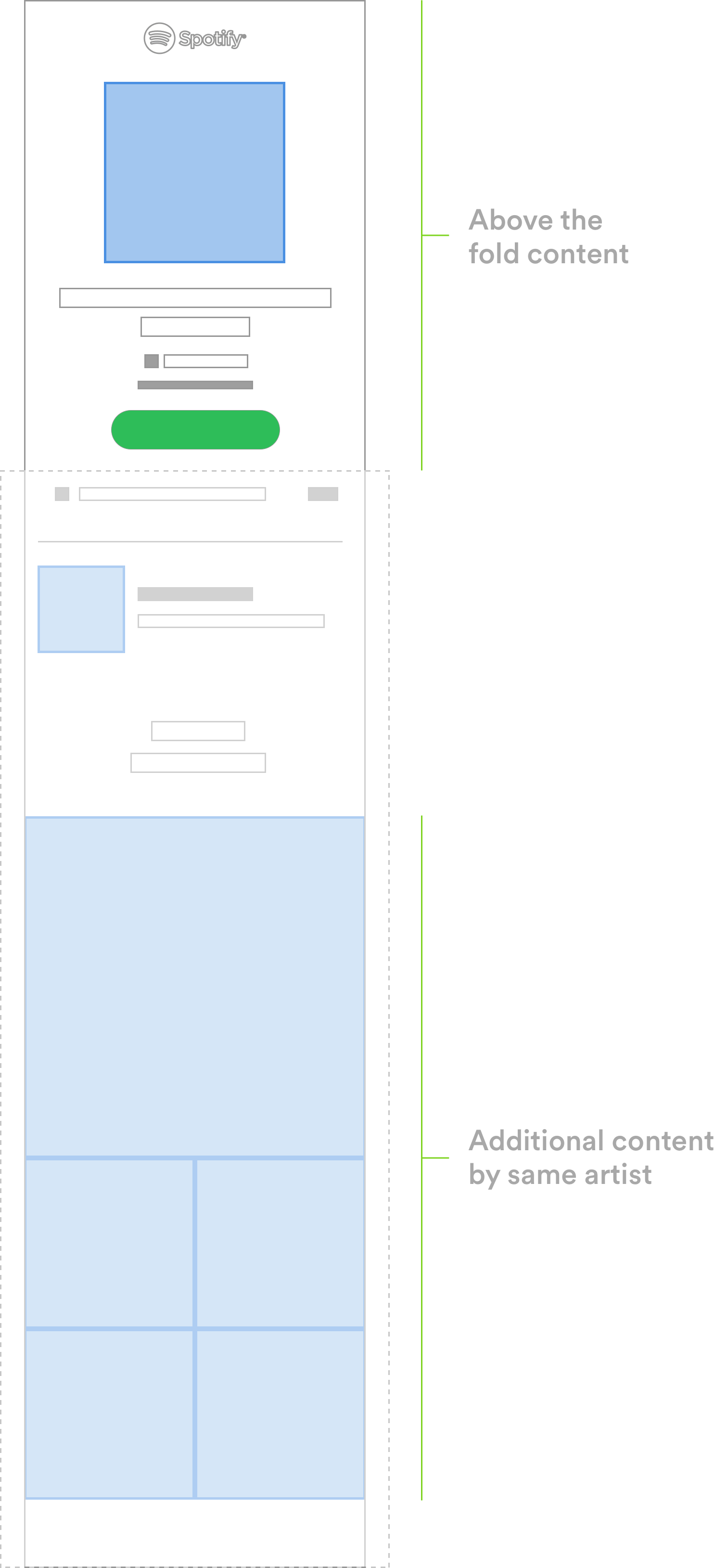
The main goal of the page is for the user to have information about the track, and click the Call to Action button (green button) to open the track in a Spotify client or sign up. That’s why it’s crucial that these elements are shown above the fold.
The main image is not lazy loaded. Doing so would delay its rendering since the browser would need to first parse and execute the JS code that does the lazy loading, and then the image would be requested. However, the rest of the images below the fold, like the ones showing more albums by the same artist, don’t need to be fetched until the user scrolls down and they enter the screen.

The Open site uses a small library that provides lazy loading. Due to its small size, it can also be inlined in the markup, so there is no need to make a request for the script and images are requested a bit earlier.
Instead of using the src attribute of an <img/> to point to the image file, we use data-src. We can also add 2x versions of the images, that will get loaded if the browser screen is a retina display.
Internally, the library makes sure the scrolling performance is not affected when using lazy load. It uses passive event listeners, throttles scroll events, caches image dimensions, and don’t process images already loaded. Finally, it uses IntersectionObserver on supported browsers, avoiding listening to the scroll event and asking for properties from the images.
Conclusion
When building a website, consider lazy loading the assets when they are needed. This is both good for the user and the site’s servers and CDNs.